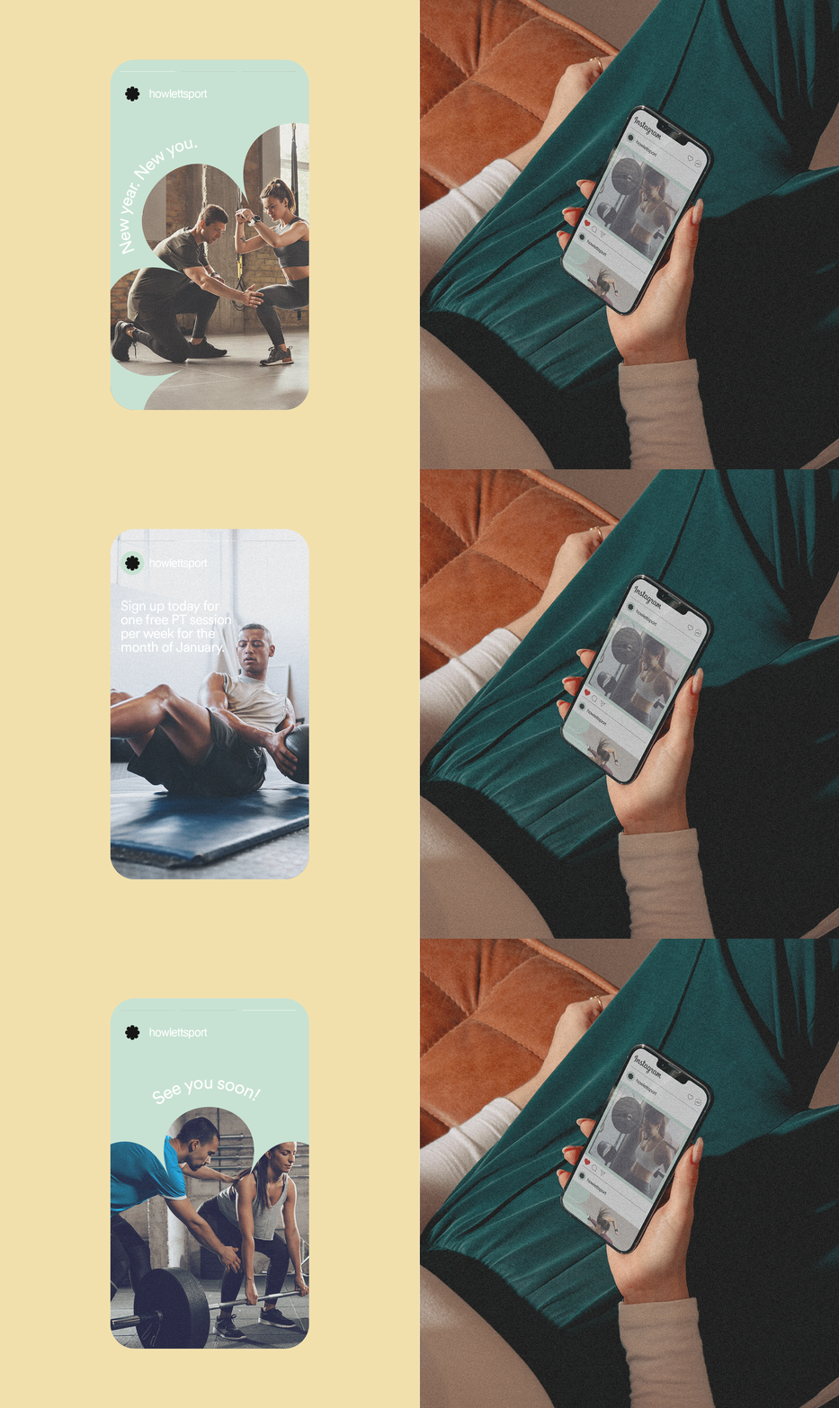
For Sydney-based PT business Howlett Sport, the design challenge was to strike a balance between a powerful aesthetic and a soft touch.
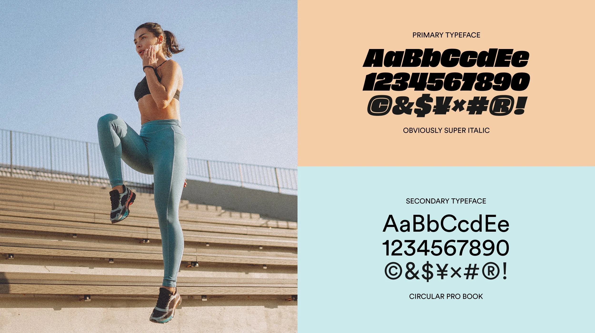
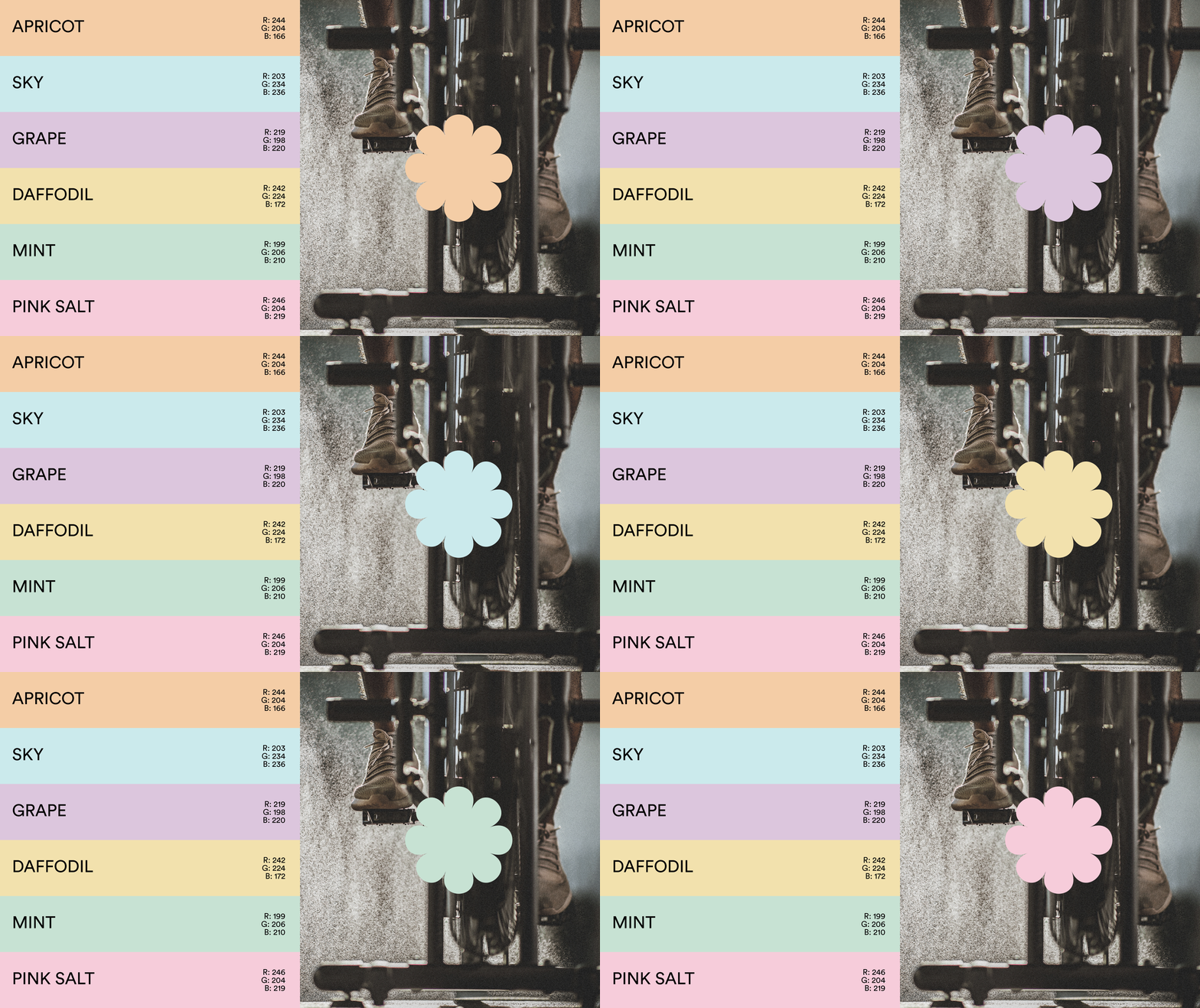
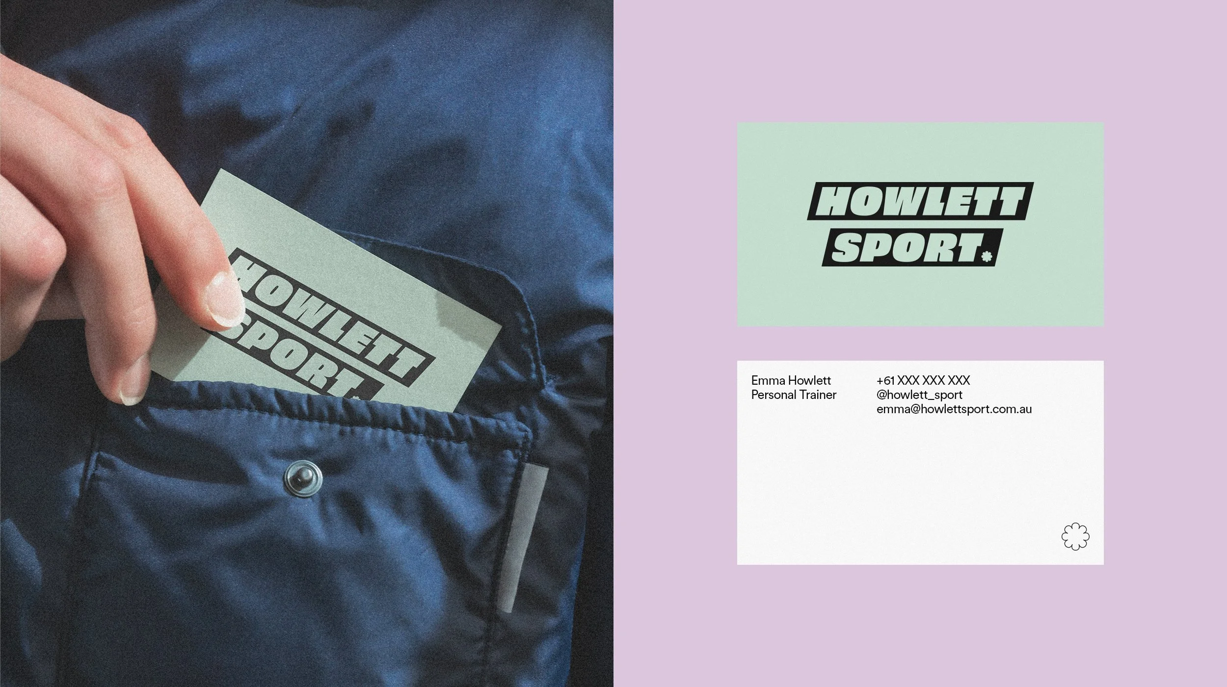
This was achieved by integrating bold typography and colour palette with pastel accents. Departing from fitness clichés and typical iconography used in the personal training space, we embraced the business owner's affinity for soft florals. The brand's flower-inspired icon serves as a unique representation of the owner, infusing strength through its bold form, while steering clear of the conventional fitness imagery.
